Global 2020 Colour Forecast

The DIY Senso by Gerflor range presented through Bunnings Warehouse is informed by colour trends from around the globe. Many ‘colour experts’ specialise in distilling global colour trends down to an annual ‘forecast report’. Here we relate interior trends for the home to the trending colours for 2020 by WGSN. Embracing all things digital, as well as analogue, the London based forcasters specialise in interpreting colour. Here in Australia and New Zealand, where the sun shines brighter and light penetrates deeply, our local colour trend interpretation informs designers from the tropical tip of Queensland to the closest landfall to the Antarctic South Pole.

trends 2

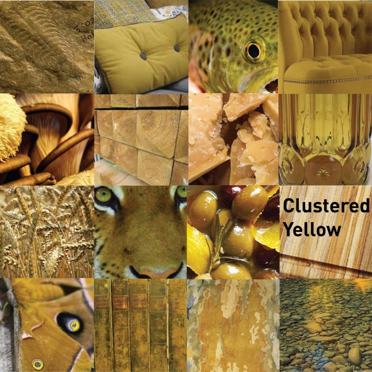
Adding sunshine to the 2020 palette is WGSN’s prediction of Mellow Yellow described as “an upbeat, playful revision to the popular 1970’s mustard tone we’ve seen gain traction in recent seasons across both womenswear and menswear styles.

The move towards all things yellow has been largely driven by the younger generation and been dubbed the next Millennial Pink. With links to Gen Z’s well-loved brands such as Snapchat, Bumble and McDonald’s the colour has been picked up by many style influencers. Think Beyonce’s infamous ‘Hold Up’ dress or Gen Z photographer Petra Collins shoot with Selena Gomez. Not restricted to one shade, varying nuances are being explored from light buttercup to imperial mustard, to our grounded mellow yellow hue.”

The toasted wheat hues of yellow flow warmly in the minds of Australians and Kiwis.   No wonder –  iconic every-day items like the famous ANZAC biscuit, New Zealand’s L&P and the Vegemite jar have showered us in a warm strong ‘yellow’ for generations and don’t look like going anywhere is a hurry.

What we call “Clustered Yellow” provides inspiration all year round from paper daisies suspended in time by baking summer heat to the rustic leaves swept along by the Autumn winds of change, this warm grown-up yellow is linked to all things upbeat, energetic and fierce.

Bursting onto the 2020 scene with confident ooze is “subdued, Cantaloupe. A silkier version of the youthful oranges which have been making noise recently. Where other infamous pastel tones were born to break down gender boundaries, orange hues offer a punchier protest. With this juicy shade drawing inspiration from nature in notes that are nurturing, soft and sweet. If we explore the psychology behind the hue, orange is known to be the colour of joy, freedom and happiness. Thought to create a balance between our physical and mental bodies. It is known to inspire freedom of thoughts and feelings, and disperse heaviness.”

Here at Senso by Gerflor we love the softer amiable version of orange, which appears to have matured from the cheeky vibrant version dominating in recent years. We call it “Creamy Cantaloupe” and love how it reminds us of our diverse interiors and the many cultural trends spread across our wide varied land. Be it Gelato brought to us by Italian families, Sapodilla from Asia or the fruit of the indigenous Finger Lime, this soft milky version of cantaloupe is easily embraced and set to radiate across the Australasian colour palette with ease.

trends 4
trends 3

One of the five main WGSN colour predictions for 2020 is “the gender-neutral and modern Cassis. A desirable fusion of the pinks and purples that have made such a huge impact in recent seasons. Subtly graduating from crushed blackcurrant to rich aubergine, the deep purplish tones of the elegantly understated Cassis draws inspiration from nature in shades that are sophisticated, colourful and rich. A natural evolution from Millennial pink, as it continues the appeal of soft, slightly feminine colours, this hue will resonate strongest in Europe, the US and Asia-Pacific.”

That means Australia and New Zealand. Much of our bushland brings the colour we have identified as “Dusky Musk” into focus. From breathtaking examples like the magnificent interior Sea Lake in the Victorian Mallee region – to the Pink and White Terraces of New Zealand’s Lake Rotomahana, rick musk colours attract international attention to our southern lands.

Red hues have historically been the domain of the privileged and wealthy – due to the difficulty in sourcing the pigments and getting them to stay put once used. This connection to opulence prevails. “Dusky Musk” the 2020 soft, welcoming pink version of red, evokes relaxation and restfulness whilst hinting to all one sees as ‘highly valued’.

High on their list for 2020 is Purist Blue – “the soft sunny evolution of blue”. The reason they love it so much is because “the depth of the sea and vastness of the sky remain icons of desire that everyone universally understands. It’s an optimistic shade which doesn’t awake emotions – it’s an emotion in its own right.”

We are on board with blue too – as it gets stronger each season in its use and resonance – from the tip of tropical Queensland to the closest landfall to the Antarctic – Tasmania. We call ours “Emu Blue” a similar soft version of blue which evokes notable memories or rekindles anecdotes whilst hinting at the digital way forward for all of us.

Technology is a large part of the 2020 “blue” story.

At least 40 blue shades were tested by Google before settling on one. Colour analysis and appreciation is a highly valued commodity too. In 2014, the results of A/B testing advertising links in Gmail and Google resulted in the original blue being tweaked to one with more ‘purple’ tones. With the backing of analytics, Google happily admits this change landed them an additional $200M in revenue. The blue story seeps even deeper into our global digital connections as it has the greatest resonance for those who live with colour blindness. One of which is Facebook’s Mark Zuckerberg.

trends 1
trends 5

The pastel shade of green, WGSN are calling “neo mint”, is one of their favourite predictions for 2020 fashion and interiors.

Here at Senso by Gerflor we love mint too. Our ‘Misty Mint’ carries Australian and New Zealand influences linking it, in a powerful way, to water and biodiversity.

The London based forecaster likes neo mint so much because it’s a gender-neutral colour that has “an oxygenating, fresh tone that aligns science and technology with nature”.

2020 will bring with it many technology-rich ‘moments in time’ – including the completion of the world’s tallest building in Saudi Arabia; the start of NASA’s Mars 2020 Rover mission; and the introduction of Uber’s flying taxis –  this helped the team to pinpoint neo mint as an important colour for the dawn of the next decade.  Nothing can halt the convergence of technology and nature as the focus on our precious environment moves firmly into the spotlight.  For this reason ‘Misty Mint’ appears set to become the standout colour for 2020.

DIY Inspiration

Design forecasting inspires and educates homeowners in ways which help them take on new DIY projects with confidence and delight. Common themes across the home maker landscape are heavily influenced by fashion, architecture and social trends. Those things we interact with in the home included in the Hottest Trends of 2020 revolve around all that is handcrafted, multi-functional, soft and refined in detail.

interior trends 4
interior trends 1
interior trends
interior trends 3

Interior Trend -Geometric

The digital age has brought with it a focus on all things ‘linked’.  Angles are cool again. The straight line, repeated, albeit in creative ways is, at the same time, a measured nod to all things artistic and ‘uncontrolled’. It is a modern trend that cleverly links everything new with everything known in ways that invite engagement and intrigue.